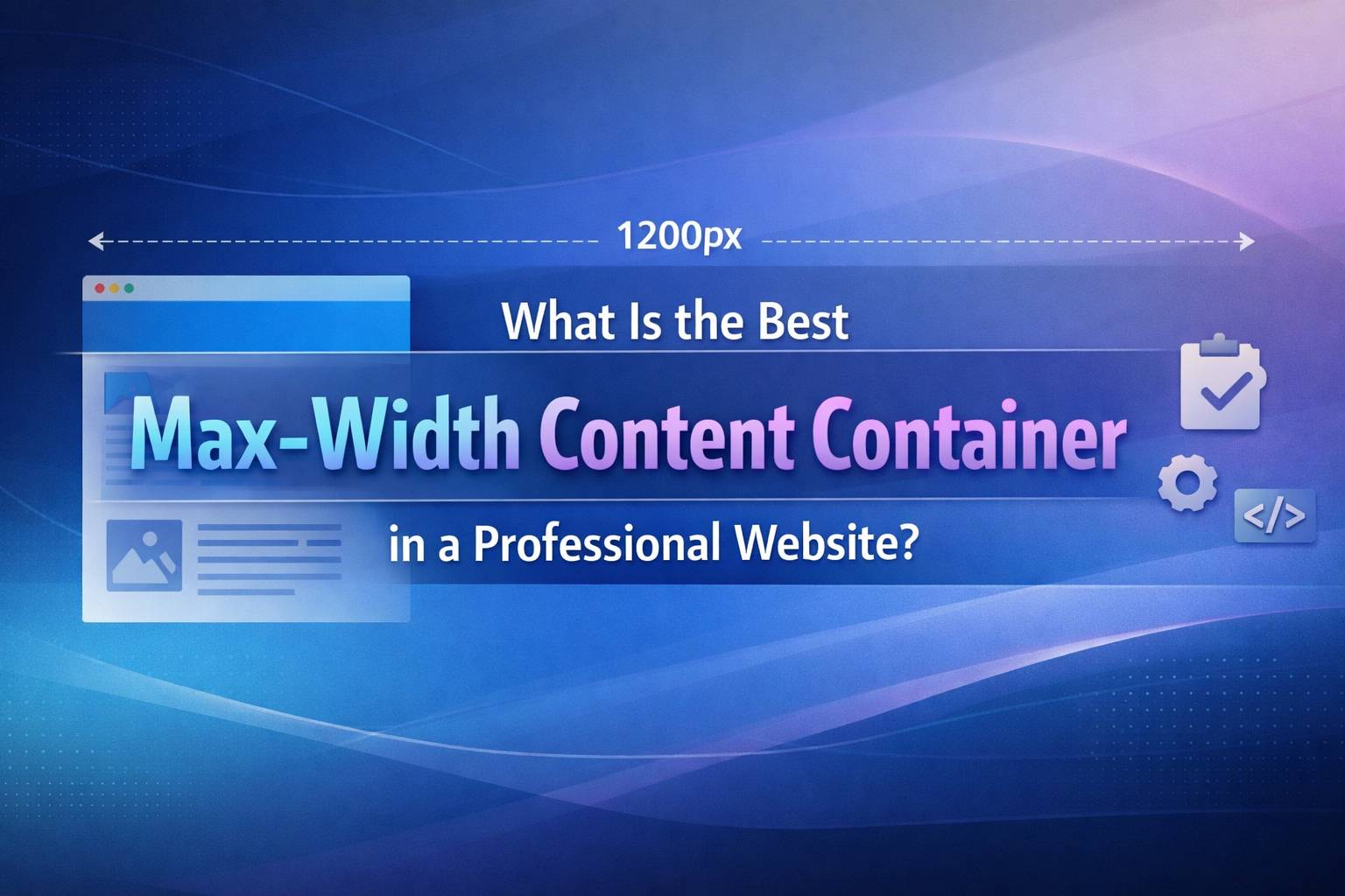
When designing a professional website, one subtle but crucial decision is choosing the right max-width for your content container. It may seem like a small CSS detail, but it directly impacts readability, usability, aesthetics, and even perceived professionalism.
In this guide, we’ll break down what a max-width container is, why it matters, and how to choose the best one for your website.
📦 What Is a Max-Width Content Container?
A max-width content container is a layout element that limits how wide your content can stretch on large screens.
.container {
  max-width: 1200px;
  margin: 0 auto;
  padding: 0 16px;
}
max-width→ Restricts content widthmargin: 0 auto→ Centers the contentpadding→ Prevents content from touching screen edges
Without a max-width, your content stretches endlessly on large monitors, making it hard to read and visually unappealing.
🎯 Why Max-Width Matters
1. Improves Readability
Long lines of text are harder to read. Studies suggest optimal line length is:
- 50–75 characters per line
If your container is too wide, users lose track while reading.
2. Enhances Visual Balance
A controlled width creates:
- Better whitespace
- Cleaner layout
- More professional appearance
3. Supports Responsive Design
Max-width ensures your content:
- Doesn’t break on ultra-wide screens
- Remains consistent across devices
📏 Common Max-Width Standards
Here are widely used container widths in modern web design:
| Device Type | Recommended Max-Width |
|---|---|
| Small websites | 960px – 1140px |
| Standard websites | 1140px – 1280px |
| Modern layouts | 1280px – 1440px |
| Wide layouts | 1440px – 1600px |
🏆 So, What’s the Best Max-Width?
✅ The Sweet Spot: 1200px – 1320px
This range is considered ideal for most professional websites because:
- ✅ Balanced readability
- ✅ Works well on laptops and desktops
- ✅ Matches modern UI frameworks
- ✅ Keeps layouts clean and structured
🧠 Choosing the Right Width (Based on Use Case)
1. Content-Heavy Websites (Blogs, Articles)
Recommended: 700px – 900px (for text areas)
Why?
- Improves reading comfort
- Reduces eye strain
👉 Example:
.article {
  max-width: 800px;
}
2. Business / Corporate Websites
Recommended: 1140px – 1320px
Why?
- Balanced layout for text + images
- Professional look
3. SaaS / Dashboard Interfaces
Recommended: 1280px – 1440px
Why?
- Needs more horizontal space
- Supports data-heavy UI
4. Full-Screen / Modern Designs
Recommended: 1440px+ (with constraints inside)
Why?
- Trendy and immersive
- Use inner containers to control readability
🧩 Best Practice: Use Nested Containers
Instead of one fixed width, combine layouts:
.container {
  max-width: 1320px;
}

.content {
  max-width: 800px;
}
This allows:
- Wide sections (hero, images)
- Narrow readable text blocks
⚠️ Common Mistakes to Avoid
❌ 1. Making Content Full Width
- Hard to read on large screens
- Feels unstructured
❌ 2. Using Fixed Width Instead of Max-Width
width: 1200px; /* ❌ Bad */
- Breaks responsiveness
- Causes horizontal scroll
❌ 3. Ignoring Padding
Without padding:
- Content sticks to edges on mobile
🎨 Modern CSS Example
.container {
  max-width: 1320px;
  margin: 0 auto;
  padding: 0 20px;
}

@media (max-width: 768px) {
  .container {
    padding: 0 16px;
  }
}
🚀 Pro Tip: Use CSS Clamp for Fluid Layouts
.container {
  max-width: clamp(320px, 90%, 1320px);
}
This creates a fluid but controlled layout.
🧾 Final Verdict
There’s no single “perfect” max-width, but for most professional websites:
👉 Use 1200px – 1320px as your primary container
👉 Use 700px – 900px for text-heavy sections
This combination gives you:
- Excellent readability
- Modern aesthetics
- Flexible responsiveness
💬 Conclusion
The best max-width content container is not just about numbers—it’s about user experience. A well-chosen width improves readability, enhances design, and gives your website a polished, professional feel.
If you’re building a modern website today, start with 1320px, adjust based on your content, and always prioritize clarity over stretching your layout.
If you want, I can suggest exact container setups used by frameworks like Bootstrap or Tailwind for your project.